The 12 Color Seasons: Finding the Palette That Actually Suits You
You've probably noticed it. Some colors make your face look brighter, sharper, healthier. Others—the same hue in a slightly different tone—make you look tired or washed out or just wrong.
This isn't in your head. There's actually a system for it. Carole Jackson wrote "Color Me Beautiful" in 1980, and the four-season framework caught on because it worked. But it was crude. Two people tagged as "Autumn" could look completely different.
The 12-season system fixes that problem. It's much more granular.
The four dimensions of personal color
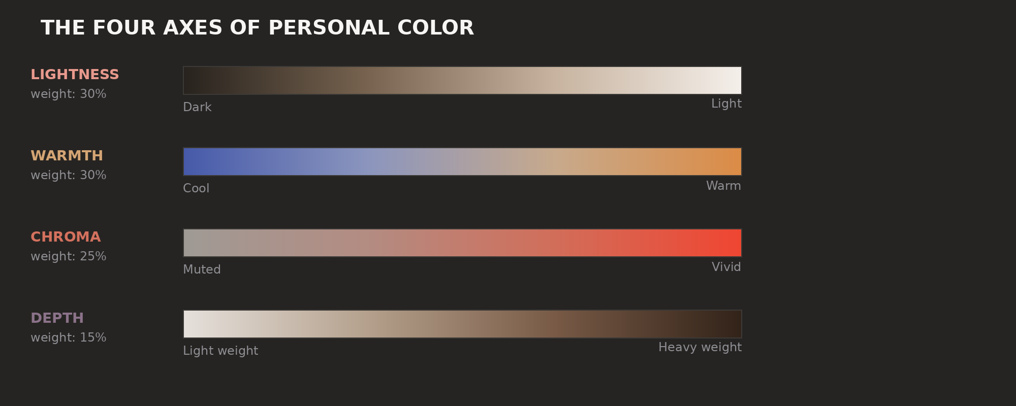
Your skin, hair, and eyes fall into patterns along four axes. These same axes determine which clothes will actually look good on you.
Lightness. On a scale from pale to very dark, where does your overall coloring sit?
Warmth. Does your skin have golden, peachy, or olive undertones (warm), or more pink, blue, or ashy ones (cool)?
Chroma. How clear and contrasted are your features? Bright blue eyes set against dark hair reads as high chroma. Gray-green eyes with mousy brown hair is low chroma.
Depth. How much visual weight does your coloring have? Deep coloring can carry dark, heavy clothes. Light coloring looks washed out in the same fabrics.
The 12-season system maps these combinations into specific palettes. Each season owns its ranges.
The 12 seasons, broken down
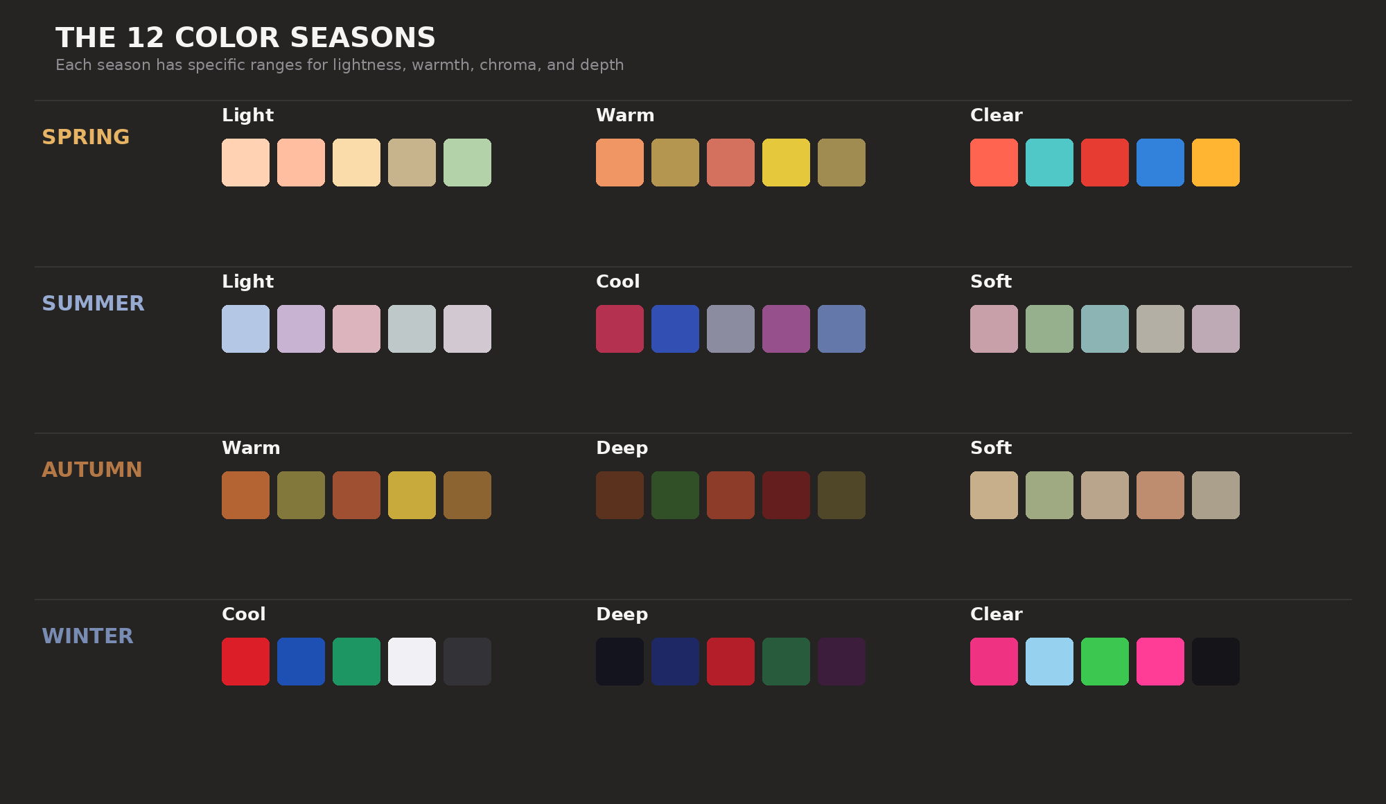
It takes the four classical seasons and adds six modifiers: Light, Warm, Cool, Deep, Clear, and Soft.
Spring seasons
Spring palettes are warm and light. The colors are fairly saturated.
Spring Light. Peach, light coral, warm ivory, soft gold. If you have fair, warm-toned skin and light golden hair, these read sunny and delicate on you.
Spring Warm. Salmon, warm olive, terracotta, sunflower yellow. The warmest of the spring palettes. Earthy, golden colors look amazing. Icy blues make you look sick.
Spring Clear. Bright coral, vivid turquoise, clear tomato red, electric blue. If muted colors make you look dull but vivid ones make your face come alive, you're probably here.
Summer seasons
Summer palettes are cool and light. Softness is the rule.
Summer Light. Powder blue, lavender, soft rose, misty gray. The most delicate. Colors almost look faded. You're probably very fair with low-contrast features.
Summer Cool. Raspberry, true blue, cool gray, plum. The coolest summer season. Silver looks better on you than gold. Blue-reds beat orange-reds.
Summer Soft. Dusty rose, sage green, soft teal, warm gray. Muted but cool. Colors look like they've been grayed down. If vivid colors make you feel overwhelmed, this probably fits.
Autumn seasons
Autumn palettes are warm and deep. You'll find rich, muted, and earthy tones here.
Autumn Warm. Burnt sienna, olive, amber, rust. Rich and earthy. This is what most people picture when they think "Autumn." But not every Autumn person fits here.
Autumn Deep. Chocolate brown, forest green, deep terracotta, oxblood. The darkest warm palette. You have deep coloring with warm undertones and can wear heavy, dark colors that would drain someone lighter.
Autumn Soft. Camel, soft olive, warm taupe, muted coral. Warm but muted. If you're warm-toned but vivid colors look wrong, this is your palette.
Winter seasons
Winter palettes are cool and often deep. High contrast is the signature.
Winter Cool. True red, cobalt blue, emerald green, pure white. Cool and saturated. Silver and platinum look better on you than gold. You can wear black and white right at your face without washing out.
Winter Deep. Black, navy, true red, forest green. High contrast and dark. You can carry heavy, dark colors that would overwhelm lighter seasons.
Winter Clear. Bright fuchsia, ice blue, vivid green, hot pink, black, white. Saturated and cool. If neon and stark black-and-white both look good on you, this is your season.
How Outfii scores season fit
Set your season in the app and it scores every outfit against your palette. The math isn't complicated:
For each color in your outfit, the algorithm measures four things.
Lightness fit. Is the color within your season's lightness range? Spring Light wants L 55–90. Winter Deep wants L 10–55. Inside the range: 1.0. Outside: the score decays.
Chroma fit. Is the saturation right? Summer Soft needs chroma 10–40. Winter Clear needs 50–100. Fall outside and the score drops.
Warmth fit. The algorithm measures the color's warmth on a scale from -1 (maximum cool) to +1 (maximum warm) and compares it to your season's bias. The closer the match, the higher the score.
Depth fit. Darker colors carry more visual weight. A navy shirt scores high on depth fit for Autumn Deep but low for Spring Light.
The weighting: lightness and warmth at 30% each, chroma at 25%, depth at 15%. Lightness and warmth are the most visible, while depth is more subtle.
The final outfit score is the average of these four numbers.
The limits of seasonal analysis
Color seasons are useful, but they're not the whole story.
Lighting matters a lot. The same outfit looks right under natural daylight and off under fluorescent lights. Your season doesn't change, but the clothes do.
There's a cultural blind spot too. Western color analysis came out of European skin tones. The system works across all skin tones—melanin-rich skin has its own warmth and depth values—but the original recommendations fit a narrower range than what actually exists.
One more thing: wear what makes you feel good. If a color is theoretically wrong for your season but you actually look great in it, you're right and the theory is wrong.
Outfii weighs season fit at 10% of your total outfit score. It matters, but it won't override everything else.
Finding your season (without paying a pro)
Professional color analysis costs $150–400. A consultant drapes fabric swatches near your face under controlled light. It works. But it's not doable for everyone.
Some DIY options:
The vein test. Look at your wrist veins in natural light. Green-tinted means warm. Blue/purple means cool. Both? You're neutral.
The metal test. Does gold or silver look better next to your face? Strong gold preference means warm seasons. Silver means cool. Both fine? You're probably neutral or Clear.
The white test. Hold pure blue-white and creamy off-white fabrics up to your face. Blue-white brightens you? Cool season. Cream warms you? Warm season.
The saturation test. Do vivid colors make you look alive or exhausted? Vivid = Clear season. Muted colors look better? Soft season.
These alone won't nail your season. But together they narrow it down. Once you have a guess, set it in Outfii and let the scoring guide you from there.
Ready to find colors that actually work for you? Join the Outfii alpha and start scoring your outfits.
Ready to transform your wardrobe?
Outfii uses AI to help you organize, style, and make the most of every piece you own.
Join the Alpha