Color Theory Isn't Just for Painters — It's How Your Clothes Work
Pick two blue shirts from your closet. Hold them next to each other. One looks great with your navy trousers, the other looks weird. Slightly off. Maybe too green, maybe too gray. You can see the difference, but you probably can't explain it.
That gap between seeing and explaining is where color theory lives. Turns out, the math behind it is more useful for getting dressed than you'd expect.
RGB is a storage format, not a comparison tool
Every digital photo stores color as three numbers: red, green, and blue. RGB. Your camera captures it, your screen displays it, and it works great for that job. But RGB wasn't designed to answer the question "do these two colors go together?"
The problem: in RGB, distance between colors doesn't match how different they look. A small green shift might be invisible to you. The same size blue shift jumps right out. RGB measures what screens need, not what your eyes see.
So the raw numbers are fine — the camera captured the color accurately. But to compare colors the way a human would, you need a different mathematical space.
LAB: the color space that thinks like your eyes
In the 1970s, the International Commission on Illumination (CIE) created CIELAB, usually called LAB. It has three axes:
L = lightness (0 for black, 100 for white).
A = green to red.
B = blue to yellow.
Here's what makes it work: LAB is perceptually uniform. Move 10 units in any direction, the color change feels about the same to your eye. Whether you're shifting reds, blues, or greens, 10 units apart always looks equally different.
That's why Outfii's engine lives here. When it analyzes your wardrobe, every pixel gets converted from RGB to LAB. The process is a bit involved (gamma correction, a matrix multiplication through an intermediate XYZ space calibrated to daylight, then a piecewise function that keeps the dark colors from breaking everything). But the result is that the math can actually talk about color the way your brain does.
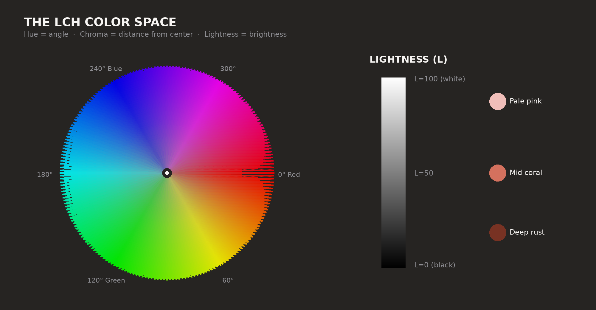
LCH: same space, better for outfits
LAB is great for measuring, useless for intuition. "Similar A values but different B values" means nothing to anyone.
LCH is a cylindrical remapping of the same space:
L = lightness (still 0–100).
C = chroma, the saturation level. Dusty rose is low chroma. Fire-engine red is high chroma.
H = hue, as an angle. 0° is red, 120° is green, 240° is blue. Everything else fills the gaps.
Now you can think in geometry. Colors 180° apart on the wheel? Complementary, they pop against each other. 30–60° apart? Analogous, they sit next to each other and feel calm. Three colors spaced exactly 120° apart? Triadic harmony.
That's exactly what Outfii does. Converts your clothing to LCH, measures the angles between hue clusters, checks them against harmony patterns. Takes about 2 milliseconds.
Why "matching colors" is harder than it sounds
A color wheel makes it look simple. But clothes exist in three dimensions: hue, chroma, and lightness.
Take a bright coral top and a muted sage green. Complementary by hue (roughly 180° apart). The pairing works. Swap that sage for neon lime green, still 180° apart, and the outfit collapses. The chroma difference is too much.
Lightness hits harder than people think. Pale lavender and deep plum are both purple, but they sit on opposite ends of the lightness scale. Together, they read as deliberate contrast. Two purples almost identical in lightness, just slightly different in hue? That reads like a failed match, like you were reaching.
This is why apps that only track hue give garbage advice. You need all three dimensions, or you're missing the whole picture.
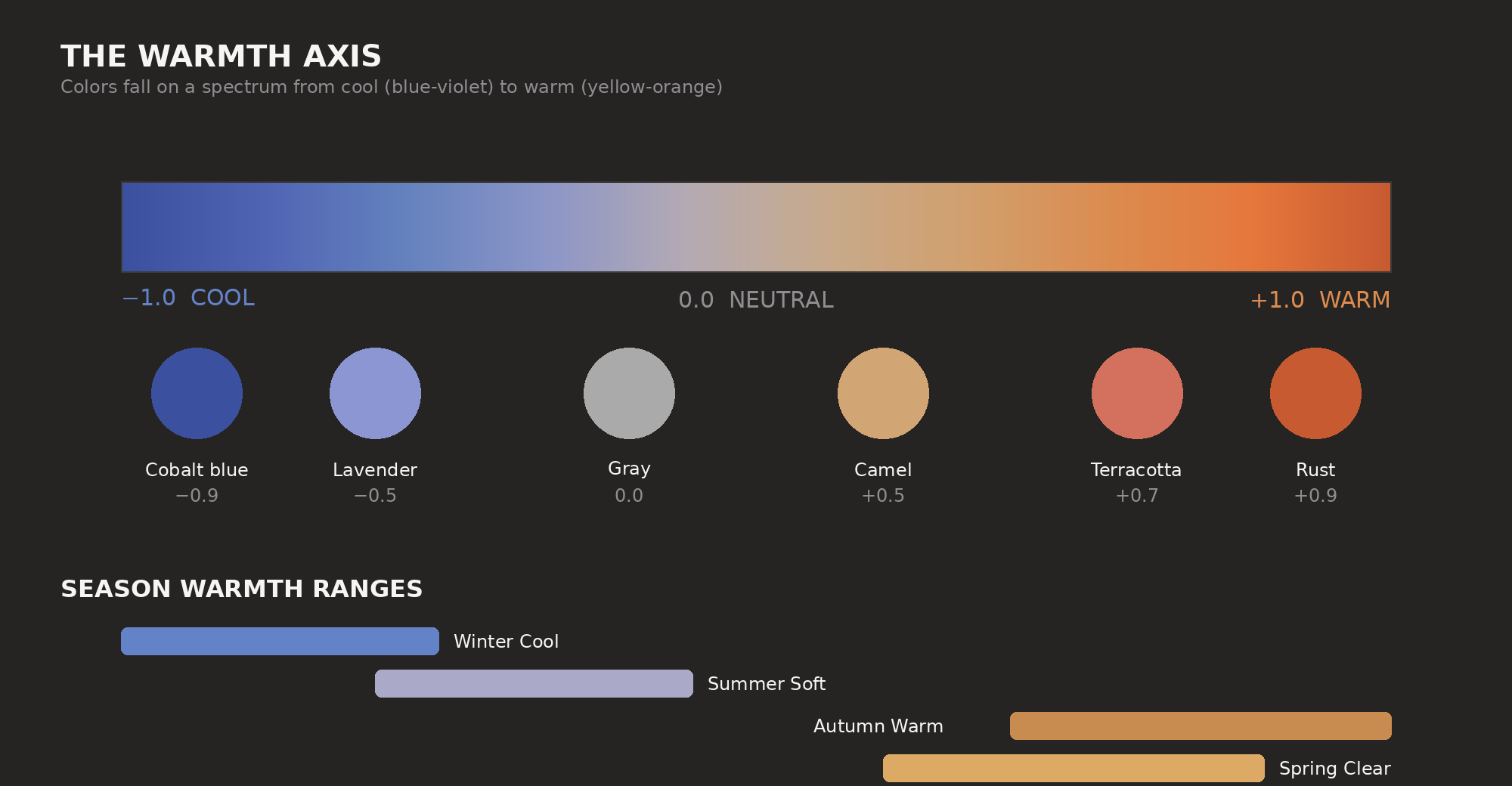
The warmth axis: why some colors feel "right" on you
The B axis in LAB (blue to yellow) is basically the warmth dial. Positive B values lean warm. Yellow, orange, golden. Negative B values are cool. Blue, violet, icy. When stylists talk about warm and cool tones, they're really just talking about where something sits on this axis.
When they say you look better in warm or cool colors, there's science behind that. Your skin, hair, and eyes have undertones. Those undertones either harmonize with the warmth of your clothes or they fight it.
Outfii scores this directly. It normalizes the B value to a warmth score from -1 (very cool) to +1 (very warm), then checks it against your color season's range. Spring wants warmth around +0.7 to +1.0 — golden, peachy, warm stuff. Winter Cool wants the opposite: -1.0, deep in blue-violet territory.
CIEDE2000: when "close enough" needs to be precise
One more formula worth knowing. CIEDE2000 measures how different two colors actually look to a human, not just their numerical distance.
Simple LAB distance doesn't cut it. Human vision is weird. We notice some kinds of shifts more than others. Hue shifts jump out more in some parts of the spectrum. Chroma differences matter more when colors are already saturated.
CIEDE2000 accounts for all that weirdness. A score of 1.0 means you'd barely notice the difference. At 2.3, it's obvious. Above 50, you're looking at red vs. blue.
Practically: this is how the app finds your "three navy tops that are basically identical" or figures out whether a color is close enough to count as monochromatic versus clashing.
So what, practically speaking
You don't need to think about LAB or LCH when you're standing in front of your closet. That's why the app exists.
But the basics explain a lot. Why certain things that "should" work don't. Why weird pairings sometimes land:
Similar hue, different chroma feels intentional. Dusty pink with hot pink works because you picked saturation deliberately. Similar hue and lightness, slightly off in either one feels like a miss, like you were trying to match and got it wrong.
Neutrals (blacks, whites, grays, tans) sit below 10 chroma in LCH space. They don't fight with anything because they have almost no saturation. This is why "build around neutrals" actually works — you're cutting down the number of hue relationships your eye has to juggle.
Complementary pairings create energy. Analogous feels calm. Triadic is bold and balanced. These aren't just art vocabulary — they're hue wheel geometry with science behind them.
Next time someone says those colors don't go together, you'll know there's an actual equation for it. Your phone already solved it while you were getting dressed.
Curious how Outfii scores the colors in your wardrobe? Join the alpha and see your closet through a different lens.
Ready to transform your wardrobe?
Outfii uses AI to help you organize, style, and make the most of every piece you own.
Join the Alpha